How Kachaam Transformed Solstice Studio's new Logo Design into a Wellness Brand Powerhouse
- Ashok Mahiwal
- Sep 10, 2024
- 2 min read
Updated: Dec 14, 2024

At Kachaam Brand Experience Agency, we help businesses carve out a unique brand identity that resonates with their target audience and drives success. In this case study, we dive deep into how we crafted an impactful logo design identity for Solstice Studios, a premier fitness and yoga studio, helping them position their brand for better visibility, stronger customer loyalty, and consistent growth.
Client Profile
Solstice Studios is a holistic fitness and yoga center offering a blend of yoga, strength training, and wellness programs designed to foster physical and mental well-being. Their philosophy is centered around balance, wellness, and community, attracting health-conscious individuals seeking to lead healthier, more mindful lives.
Our Approach
We understood that Solstice Studios needed a logo design that wasn’t just visually appealing but one that communicated their core values of health, vitality, and tranquility. We focused on designing a brand identity that:
Attracted health-conscious clients
Reinforced the studio’s focus on well-being and personal growth
Stood out in the competitive wellness market
Symbolism & Connection
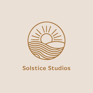
The logo we designed reflects the natural balance that Solstice Studios promotes. A rising sun—symbolizing energy and renewal—over a serene landscape encapsulates their mission of holistic health. The flowing waves suggest fluidity and harmony, mirroring the blend of strength training and yoga that they offer.
Color Psychology
To ensure the logo's emotional impact aligned with Solstice’s goals, we focused on colors that radiate warmth, serenity, and strength:
Earthy Brown: Evokes stability and grounding, reinforcing the studio’s deep connection to nature and balance.
Soft Beige: Creates a calm, welcoming space, signifying purity and a focus on inner peace.
Typography: Minimalist, Modern, and Clean
We chose a modern sans-serif font that exudes simplicity, professionalism, and approachability. The rounded shapes mirror balance and flow, reinforcing the brand’s message of harmony between mind and body.
Brand Narrative: Connecting Through Symbolism
The logo is more than a mark; it tells a story. The rising sun represents renewal, while the waves symbolize movement and flow—elements essential to the yoga and fitness experience. Every element in the design was chosen to echo Solstice Studios' mission: guiding members on a journey toward holistic well-being.
The logo we created for Solstice Studios does more than make them recognizable; it has positioned them as a leader in holistic wellness. This identity has driven engagement, fostered community loyalty, and reinforced the brand's dedication to personal growth and health.
Ready to Elevate Your Brand and User Experience?
Discover how Kachaam Design Agency can craft seamless digital experiences, create captivating brand identities, and provide on-demand design solutions through our premium services. From insights that shape tomorrow to design innovations delivered daily, we are here to help your brand stand out. Let's make it happen—get in touch!


Comentarios